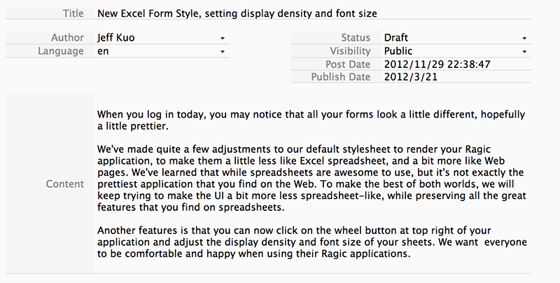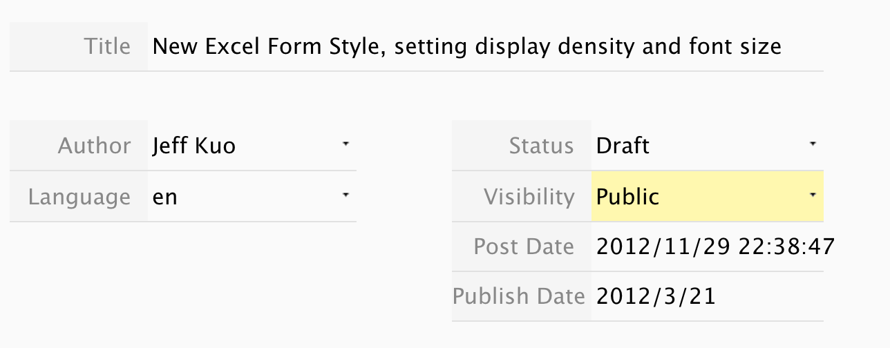
When you log in today, you may notice that all your forms look a little different, hopefully a little prettier.


We've made quite a few adjustments to our default stylesheet to render your Ragic application, to make them a little less like Excel spreadsheet, and a bit more like Web pages. We've learned that while spreadsheets are awesome to use, but it's not exactly the prettiest application that you find on the Web. To make the best of both worlds, we will keep trying to make the UI a bit more less spreadsheet-like, while preserving all the great features that you find on spreadsheets.
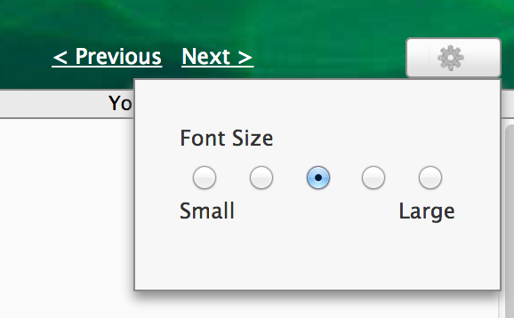
Another features is that you can now click on the wheel button at top right of your application and adjust the display density and font size of your sheets. We want everyone to be comfortable and happy when using their Ragic applications.