 Design guide
Design guide
Design guide
To compare the "proportion of different items within a group" or "percentage differences" of the data in your sheet, you can use the Pie Chart in Ragic Reports. For example, you can analyze the proportion of different customer types, percentage differences in revenue across categories, or compare inventory quantities of various products.
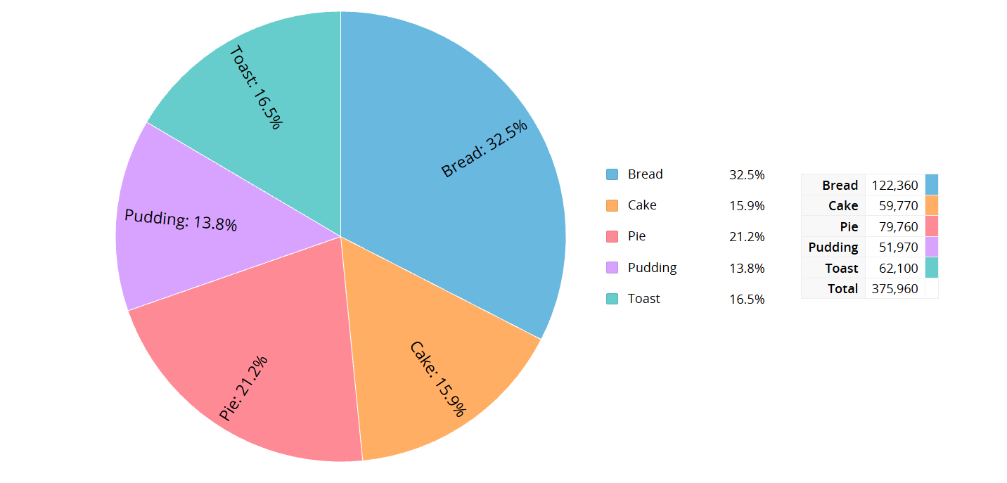
However, be mindful that a Pie Chart may not be suitable when there are too many items or when differences between items are minimal, as this can make analysis difficult.
After creating the Pie Chart report, the following page will appear. In the upper left section, you can select the field you want to analyze.
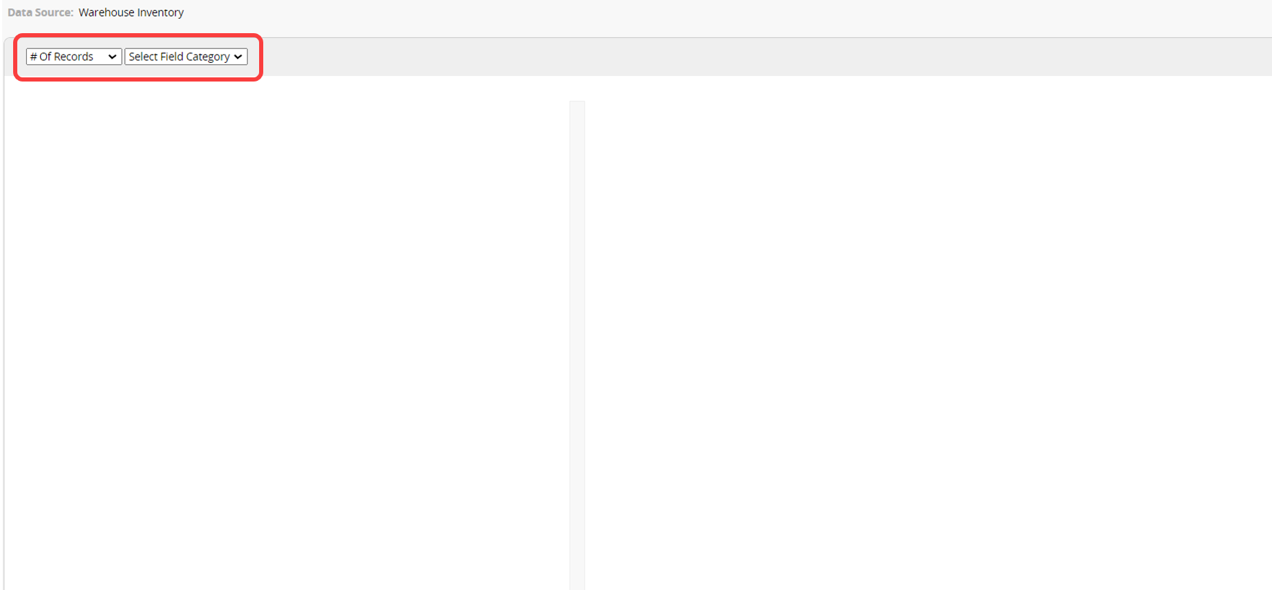
The following explains each setting in the Pie Chart in order:
In the first field at the top left corner, you can select the target value for analysis, choosing from # of records or Numeric/Money fields from the sheet.
The next field lets you select the field to analyze. After selecting, a second field option will appear on the right. Choosing one field will display a "single-layer" Pie Chart, while selecting two fields will show a "double-layer" Pie Chart.
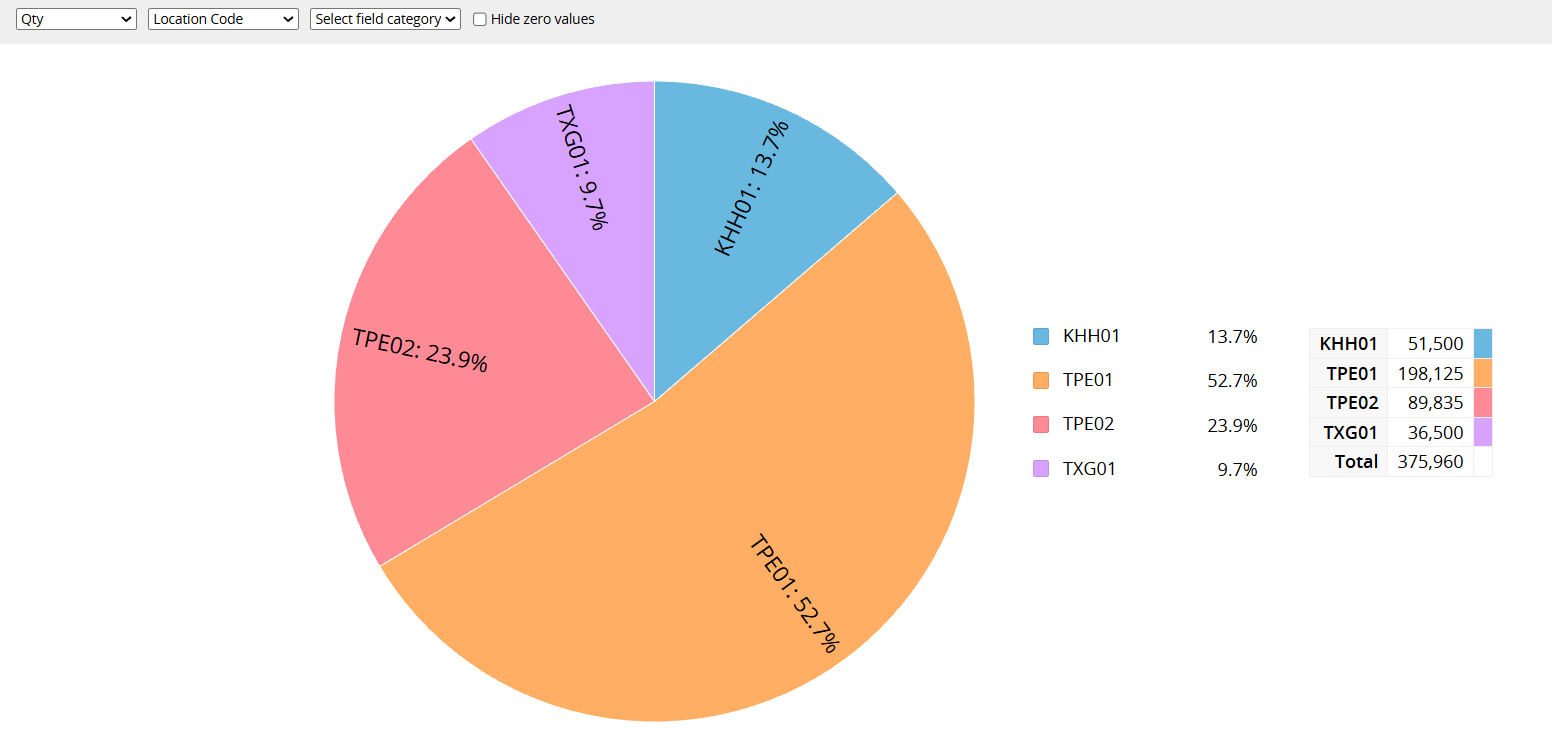
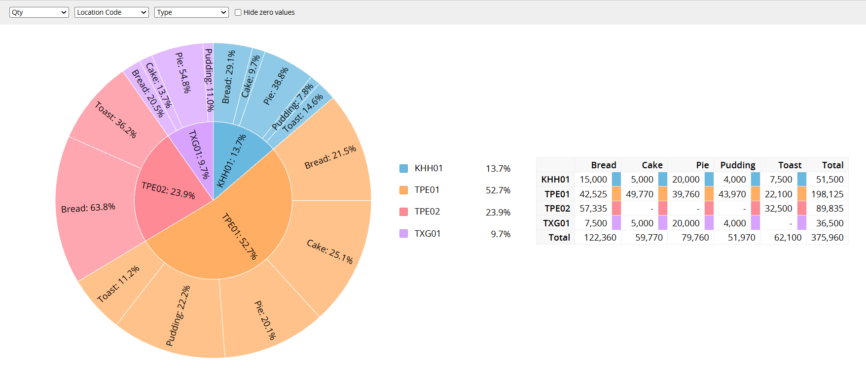
The Pie Chart displays the proportion of each item within the whole. On the right side, a diagram shows the actual values and total for each record. Hovering over different segments of the Pie Chart will also reveal the exact value of each item.
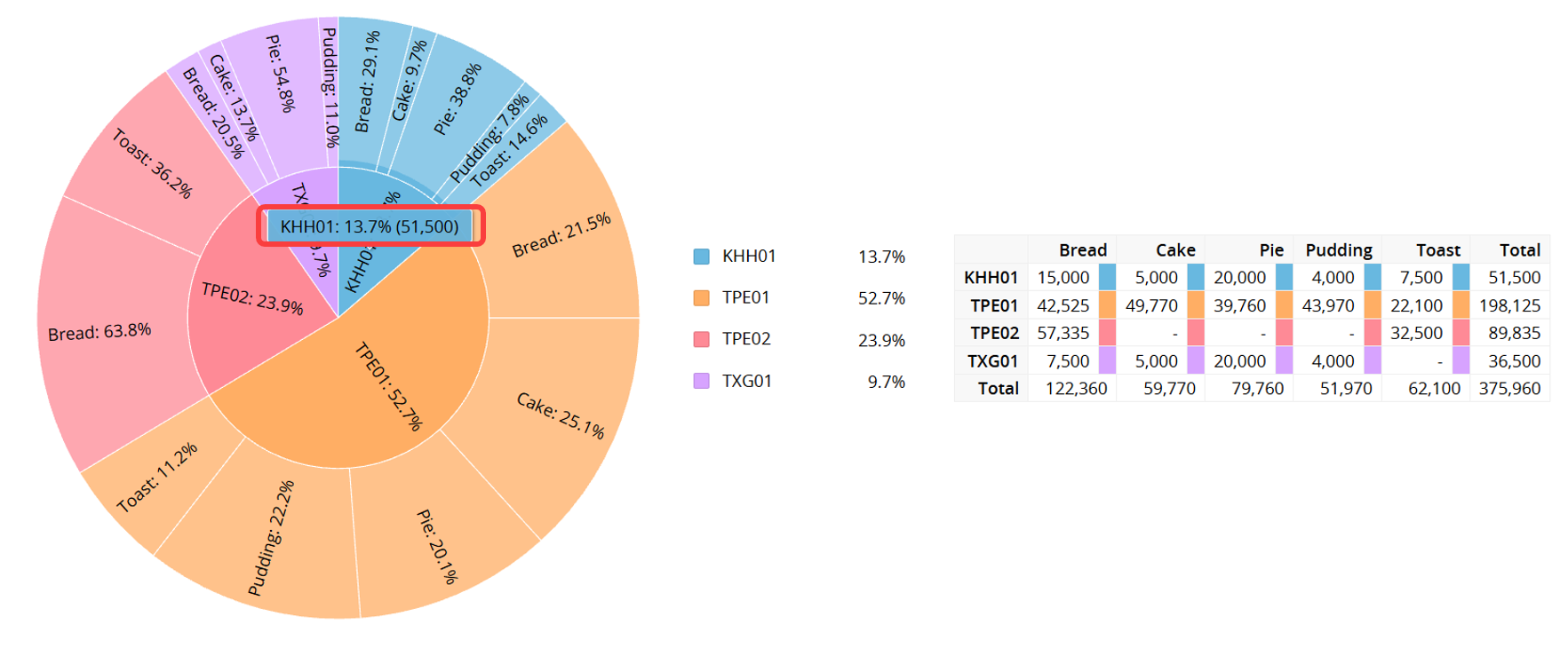
1. Hide zero values: By default, the table next to the Pie Chart displays items with a value of 0. You can check this option to hide those zero-value items.

2. List the choices in the multi-select category field separately: When the target value is set to # of records and the analyzed field is a multi-select field, you can check this option to list and count each choice individually. If two layers of categories are set, a Category 2 checkbox will appear, letting you split that layer as well.
Note: When this option is checked, the table will not display the total.

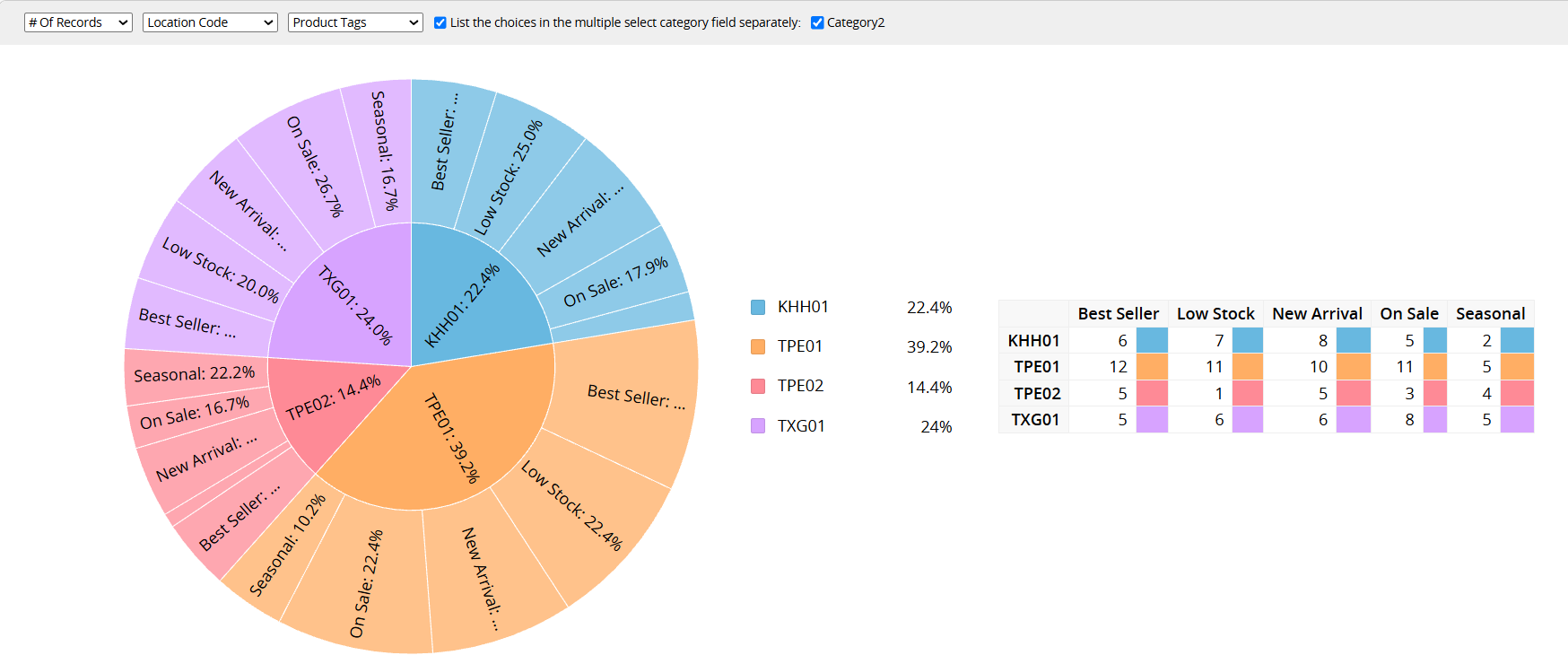
If you frequently use this type of report, you can save it for easy access later. Additionally, you can export the report as a PDF file or print it.
You can apply filters to generate the desired report.
You can embed the report into your website or share a link with others.
In the Report Settings, you can adjust the report's style settings, including font, font size, borders, etc., and the report's Filter and Access Rights.
Once a report is saved, you can use a Report Snapshot Schedule to automatically save a snapshot of the report at regular intervals, and view its state at different points in time in the Report Center.
You can create an Editable Report Snapshot to highlight data, apply styles to the report content (for example, bold, underline, or font color), or add tables and explanatory text.
 Thank you for your valuable feedback!